Josef Albers finally made me understand how colors work
A little blabbering session on how I fully came to understand color theory years after graduating from art school, and how ultimately fashion and art will always be intertwined.
The first thing a student in art school is expected to learn is color theory. Regardless of your major or area of study, it’s an essential part of our education. I struggled with this concept growing up, as I always operated on moods and vibes to dictate what I deemed beautiful, reasonable, and cohesive in terms of color pairings. There is no explanation behind it, but for some reason, my 'favorite colors' happen to be green and purple. I’ve always despised the idea of having a favorite color, as I believe that we, as human beings that are attracted to the concept of beauty, can have ever evolving tastes in quite literally any subject matter.
Mark Rothko and Josef Albers, two incredible artists whose works are among my favorites, are equal parts subtle and minimalist, intentional and subliminal. Their mastery of color has sparked deep interest in anyone who encounters their phenomenal art. No wonder so many designers, architects, filmmakers, and fashion designers continue to draw inspiration from their oeuvres for collaboration and innovation.
Color has always been a powerful force in art and design, but it wasn’t until I stumbled upon Interaction of Color by Josef Albers that I truly began to appreciate its depth. I remember the first time I came across one of the many pieces from his Homage to the Square series—and something clicked. Suddenly, I started to understand color not just as a visual tool, but as a dynamic experience. Through his groundbreaking experiments with color relationships, Albers reshaped my understanding of how color can influence perception, emotion, and meaning. His book Interaction of Color was eye-opening, teaching me not only about color theory but also about the ever-changing nature of color itself. Here, I’ll try to explore how Albers’ work—especially the Homage to the Square series and the insights from his book—has transformed the way I approach color in both my creative practice and daily life.
Interaction of Color is one of Albers' many important contributions to color theory, and it offers a more practical, hands-on approach to understanding color relationships. It isn’t just a guide to mixing colors or choosing aesthetically pleasing palettes. It’s a comprehensive study of how colors interact with each other and how our perception of color is never fixed. Instead, Albers presents color as a dynamic, relational experience that can change depending on context, placement, and surrounding colors.
Color perception is always relative. He emphasizes that a color doesn’t exist in isolation; how it looks depends on what’s around it. It totally flips the way we usually think about color—where we tend to imagine colors as fixed and set in stone. Albers shows us that the same color can look totally different depending on its surroundings. For example, a color next to a dark background can seem lighter, while that same color next to a light background might look darker. It's something we all experience in our daily lives, but Albers’ work gave it a name and explained what’s going on.
“A plausible explanation: One theory maintains that the nerve ends on the human retina (rods and cones) are tuned to receive any of the 3 primary colors (red, yellow, or blue), which constitute all colors. Staring at red will fatigue the red-sensitive parts, so that with a sudden shift to white (which again consists of red, yellow and blue), only the mixture of yellow and blue occurs. And this is green, the complement of red. The fact that the after-image or simultaneous contrast is a psycho-physiological phenomenon should prove that no normal eye, not even the most trained one, is foolproof against color deception. He who claims to see colors independent of their illusionary changes fools only himself, and no one else.” (Albers, Interaction of Color, page 23)
His approach emphasizes that color is best understood through experimentation and experience. In his book, he encourages readers to experiment with juxtaposing colors in different contexts to see how they affect each other. By playing with these combinations, one can better understand how to manipulate color to achieve certain effects or create emotional responses.
“But when these temperature indicators, red and blue, are combined with color neutrals, as whites, blacks, and greys, and with their mixtures, particularly in mixtures with the temperature neutrals green and violet, then personal interpretations of temperatures may easily become disparate.” (Albers, Interaction of Color, page 59)
He uses several exercises to show how these ideas work, like putting complementary colors next to each other to make them pop, or using similar tones to create subtle shifts. These exercises prove that color isn’t just sitting there in the background—it’s an active player in the design process. Even small changes in how colors relate to each other can totally change how we see them. Another key idea Albers dives into in Interaction of Color is the concept of transparency. He explains how certain colors can seem to blend together or ‘bleed’ into one another, depending on where they are placed. This can create the illusion that a color is more see-through than it really is, giving the illusion of depth or layers.
Albers’ hands-on approach to color theory in Interaction of Color is one of the reasons his work remains so relevant today. Unlike traditional color theory, which is all about mixing colors and creating harmonies, he pushes readers to think of color as more than just an aesthetic choice—it’s a way to communicate and express ideas. He shows us that color isn’t a passive element in design; it’s an active, ever-changing player. His theories suggest that color can set the tone for a piece, guide the viewer's eye, or even mess with our emotions. These concepts have a big impact on anyone working in design, fashion, art, or any kind of visual media—and they can really inspire more thoughtful and intentional use of color.
The Homage to the Square Series:
Albers’ Homage to the Square series, which he worked on for over 25 years, is arguably one of his most iconic contributions to art and color theory. At first, the series might seem incredibly simple: it consists of geometric squares, usually stacked one within the other, with each square a different color. But here’s where the magic happens—the genius of this series lies in its ability to show just how complicated colors can be when they interact with each other and how those interactions can totally change our perception of color itself.
The most important lesson we can take from Homage to the Square is that color is not a fixed entity. The same color can look completely different depending on the colors surrounding it. Albers famously demonstrated this by showing how the perception of a color changes when it’s placed next to another color — even if they’re the same color in different contexts.
For example, a blue square may appear darker when placed next to yellow but lighter when placed next to black. Albers was always playing with this idea, showing how the way colors relate to each other can create depth, movement, or even tension. He loved working with what seemed like simple color combinations, but with just the right choices and placement, they became anything but simple. The colors would appear to vibrate, shift, and even change their hue, depending on what surrounded them. I never realized how much a color could change just by where it’s placed. I used to think of blue as… well, blue. But through the Homage to the Square series, I started noticing how it could look warmer or cooler, lighter or darker, just by being next to a different color. Now, I’m much more thoughtful about how I pair colors, whether in my artworks or when I’m putting together an outfit, always thinking about how they’ll play off each other. The idea that colors can shift and change based on their context is pretty powerful—it really shows how dynamic color perception can be.
Another big takeaway from Homage to the Square is how Albers used minimalism to dive deep into color relationships. The simple square shape let him really focus on how color changes depending on its surroundings, without getting distracted by complicated shapes or forms. By using just a few colors in each piece, Albers could dig into the little details of how colors interact. Its minimalist style also made the work feel timeless, stripping away anything unnecessary and letting the colors take center stage. Albers’ approach showed that minimalism in art or design isn’t just about keeping things simple for the sake of it—it’s about clarity, precision, and really zeroing in on what matters most: in this case, color itself. Simplicity has the potential for communicating complex ideas.
One of the most profound lessons I took from Homage to the Square is how color can express emotion. I began to notice how certain color combinations would make me feel calm or energized. When I use red and orange, I feel a surge of energy and warmth. When I use cooler colors like blue and green, I notice a sense of calmness wash over me. Albers taught me that color is more than a visual tool—it’s a way to evoke feelings and moods in the viewer. The series demonstrates that color is not only a visual tool but an emotional and psychological one. Albers himself was fascinated by how colors could evoke certain feelings or moods. He often paired colors that caused tension or harmony, and through this, he shows us that color choices can communicate more than just visual aesthetics.
Color is not just an aesthetic choice, but a tool for creating depth, perception, and emotion. It encourages you to think more critically about how colors can affect how others perceive, feel, and engage with almost anything.
Contemporary Examples Inspired by Albers' Work:
One of the coolest things about studying Josef Albers’ work is realizing how art can actually shape our everyday lives, especially when it comes to fashion and self-expression. Albers’ color theory isn’t just for the canvas—it spills over into everything from interior design to what we wear, sparking creativity in ways we might not even notice. The way he used color to stir emotions, create depth, and mess with our perception has a huge impact in industries like fashion, where color is a big part of how we express who we are.
Art and design are inherently linked to personal identity, and Albers' work has influenced how many designers approach color in their collections. Fashion, as one of the most direct forms of personal expression, has been heavily influenced by artists like Albers. Whether it’s the bold, vibrant hues of a dress or the subtle interplay of colors in accessories, visual art has a profound impact on what we choose to wear. Albers’ work in color theory is an inspiration for those seeking to use color to not only make a visual statement but to communicate something deeper about themselves—emotions, identity, or even a narrative.
J.Crew is a brand that learned how to incorporate art and design references in its campaigns in the best way possible, offering an exciting intersection between high fashion and art history. An example is a recent campaign where the brand stacked sweaters in bold color combinations, paying homage to Josef Albers’ geometric color explorations, particularly his Homage to the Square series.
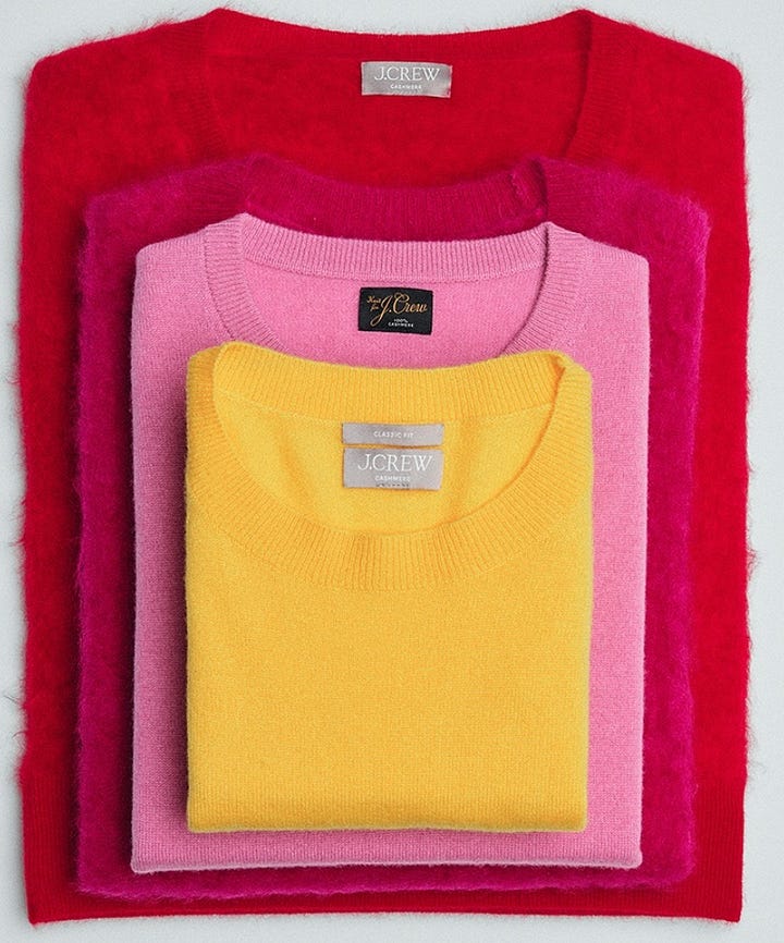
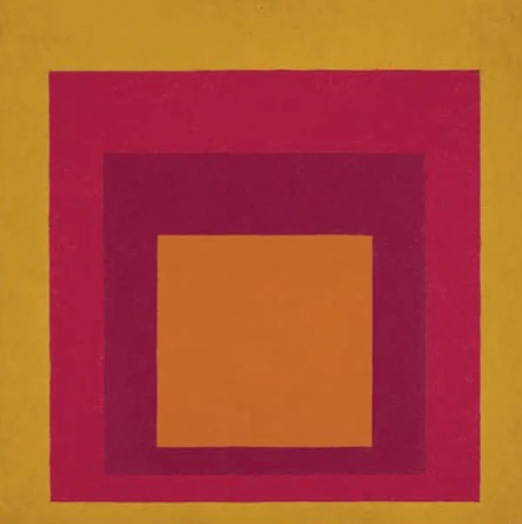
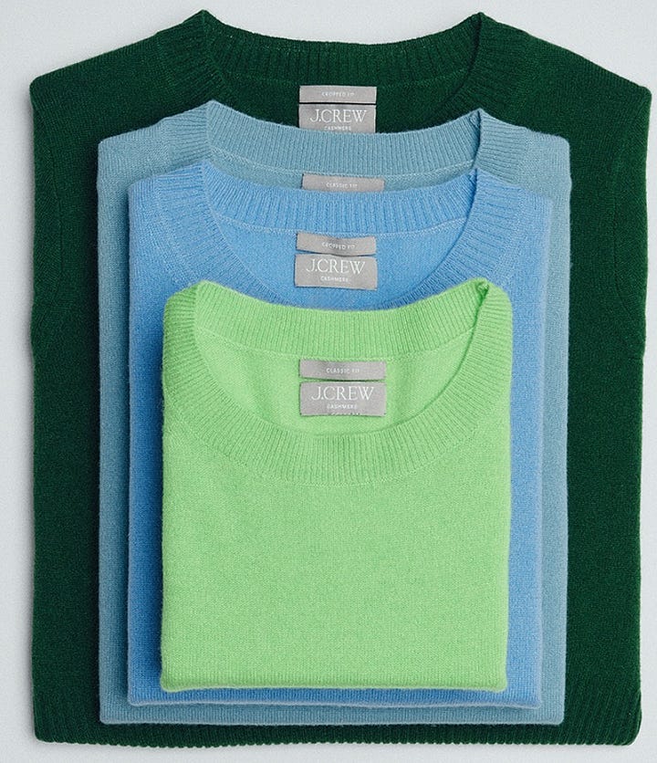
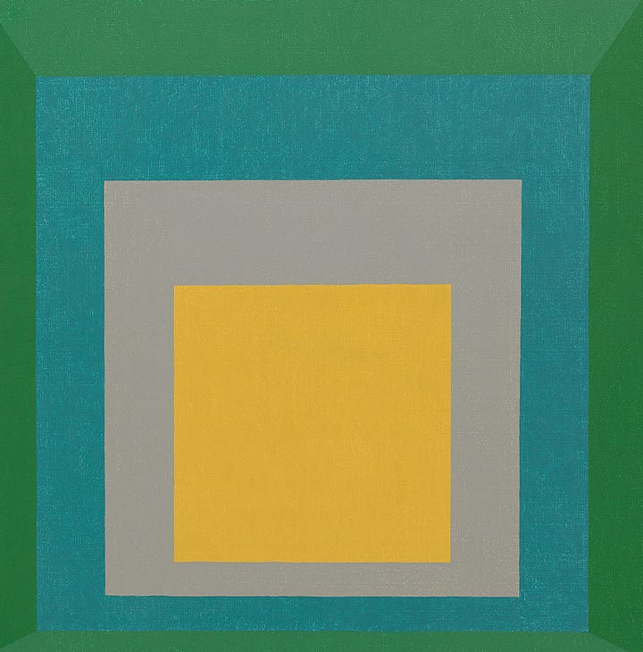
Albers’ work with color and geometry was all about how simple shapes, like squares, could show off the subtle shifts in how we see color depending on how it’s arranged. This setup, like the stacked sweaters, is kind of like Albers’ use of basic geometric forms and his fascination with how the way colors, when placed next to each other can totally change how we perceive them.
Another recent collaboration, this time with the Josef and Annie Albers foundation—Loewe’s Fall Winter 2025 collection draws on Albers' color schemes and show how his influence continues to shape contemporary design. The collection which includes bags, coats, and other pieces, takes direct inspiration from Albers’ iconic works and his approach to color.
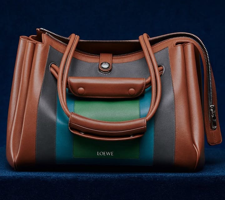

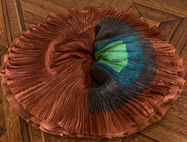
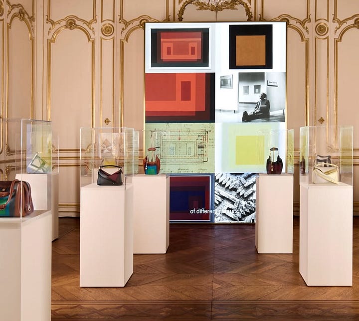
By using actual works from Albers’ portfolio as a reference and mutual collaboration, Jonathan Anderson not only acknowledges Albers’ impact on modern art and design but also makes a bold statement about the timeless relevance of color theory in fashion. The designs incorporate Albers' geometric color palettes and his sophisticated use of color contrast, resulting in accessories that aren’t just functional but also a form of wearable art, which happens to be Anderson’s preferred method of making statement and conversation starter pieces.
This collaboration highlights the idea that color is not only for visual pleasure but is also a tool for creating deeper emotional responses—something that Albers fully understood and that Anderson not only understands, but translates beautifully. The designs create this feeling of order and balance, but they also play with how we see color and the emotions that different hues can stir up.
Before diving into Albers' work, I used to think of color mostly in terms of aesthetic preferences—what I liked or thought looked good. I might have chosen a color because it was vibrant or trendy, but I never really understood the deeper relationships between them. Interaction of Color helped me change the way I see things—it showed me that colors aren’t just standalone choices, but dynamic forces that shift depending on their context. The book introduced me to a much deeper way of thinking about color —it’s not just about choosing a "nice" color palette, but about understanding how colors interact, how they affect each other, and how their surroundings impact our perception of them.
Learning through this thorough exploration of color has totally changed how I approach my creative projects, whether it’s for my own art or for ByBenchis. But the best part? It’s helped me understand my personal style and tastes way better—like when I was redecorating my room. I always thought red and purple were a terrible combination, but now I’m actually thinking about putting up red wallpaper with a purple accent chair! Who would’ve guessed?! My personality can now be visible in a subtle way, not just through design elements but by playing around with color combinations. I also started experimenting with color contrasts in my art. Albers’ work gave me the confidence to use color in ways I never thought I would, and the results? Way more exciting than I ever expected!
It’s amazing how much color surrounds us in our daily lives, and this certainly taught me to look at it with a more discerning eye. I’ve become more conscious of colors in my everyday life, and I’ve started making intentional choices in my wardrobe, experimenting with color combinations I would have never considered before. For example, pairing mustard yellow with teal, which Albers often did, brings warmth and balance to anything, and I now use this pairing to create an inviting and vibrant aura.
Ultimately, Josef Albers has transformed the way I see the world around me. What once seemed like a simple aesthetic decision now feels like an intentional act of expression. His work has taught me to consider the relationships between colors, how they can communicate emotion, and how we can use them to enhance the spaces we inhabit, the designs we create, and the way we present ourselves to the world.
One of the most empowering things I’ve learned from studying Josef Albers, is that color isn’t just a design element—it’s a way to express yourself. Albers shows us that color is tied to emotions, how we perceive things, and even cultural context. As I started to get into his exploration of how colors relate to each other and their psychological effects, I realized that color can communicate way beyond just looking good—it becomes its own kind of language.
In his Homage to the Square series, Albers used color not just to create visual contrast, but to evoke emotions through each color combination. For example, the mix of warm reds and cool blues can stir up different feelings depending on how they’re placed next to each other. Once I started to see how color could feel and move on the canvas, it totally changed how I approached my creative projects. Whether I was designing a graphic, styling an outfit, or arranging colors in my apartment, I started to think of color as a way to create a mood.
Beyond mood, color also plays a significant role in shaping our identity. Think about the colors you naturally gravitate toward. For me, the rich greens and purples I’ve always loved represent a sense of personal depth and individuality. Albers’ experiments with color helped me understand that our attraction to certain colors isn’t arbitrary—it’s tied to our emotions, experiences, and even our cultural associations. This insight totally changed how I think about color in relation to who I am and how I present myself. Whether it’s fashion, design, or even interior decor, the colors we choose are subtle yet powerful ways to express ourselves.
Color has become an instinctive tool for expressing emotions. It's no longer just about following color theory rules—it’s about picking hues that match the feelings or stories we want to tell. When we want to create a sense of calmness, we go for cool blues and soft greens. When we want to energize or grab attention, we turn to bold reds or yellows. Albers’ lessons show us that color has the power to shape how we experience the world, and we can use it to form deeper, more personal connections.
Josef Albers showed us that color isn’t just something we see—it’s something we feel and experience, shaped by context, perception, and interaction. For Albers, color was always an experiment, a dynamic force that shifts depending on how we see it, how it interacts with other colors, and how it makes us feel.
Looking back on Albers' ideas, I’ve learned to see color not just as a design and aesthetic tool, but as a language for self-expression and emotional connection. I’ve realized that color can do so much more than just “look good.” It’s a living, breathing thing, always changing depending on how we pair it with other colors. It’s a way to shape the world around us. Through Albers’ work, I’ve come to appreciate color not just for what it is, but for what it can do. Whether I’m creating something new or simply looking at the world through a different lens, I now approach color with a deeper understanding and appreciation. And for that, I’m truly grateful.


